If you’re a new investor, we suggest starting out by reading this investing guide for beginners and investing in index funds or mutual funds. This will keep your portfolio diversified and reduce risk while you learn more about the stock market.
If you already have a good foundational knowledge of investing and want to improve your stock-picking acumen, read on.
Getting started with investing can seem intimidating, or for some, downright terrifying. But you’ll need to know how to read and understand stock charts if you want to make informed decisions when buying individual stocks.
In this article, I’ll break down the essentials of a stock chart and explain the key things you need to focus on. By the end of this useful guide, terms like “dividend,” “trendline,” and “lines of support” won’t sound so foreign.
What exactly is a stock chart, and how does it help you analyze stocks?
Simply put, a stock chart is a graph that shows you the price of a stock over a specific period of time — for example, five years. More advanced stock charts will show additional data, and by understanding the basics you can pull out a lot of information about a stock’s historic, current, and expected performance.
Now let’s take a look at a typical stock chart. For the sake of this article, let’s use Apple as an example stock, as displayed on Yahoo! Finance.
If you don’t already know, the series of letters after the name of the company is the ticker symbol. It identifies the company on the stock exchange.
In this case, I’ll search for AAPL, which is Apple’s ticker symbol. This is what we get:
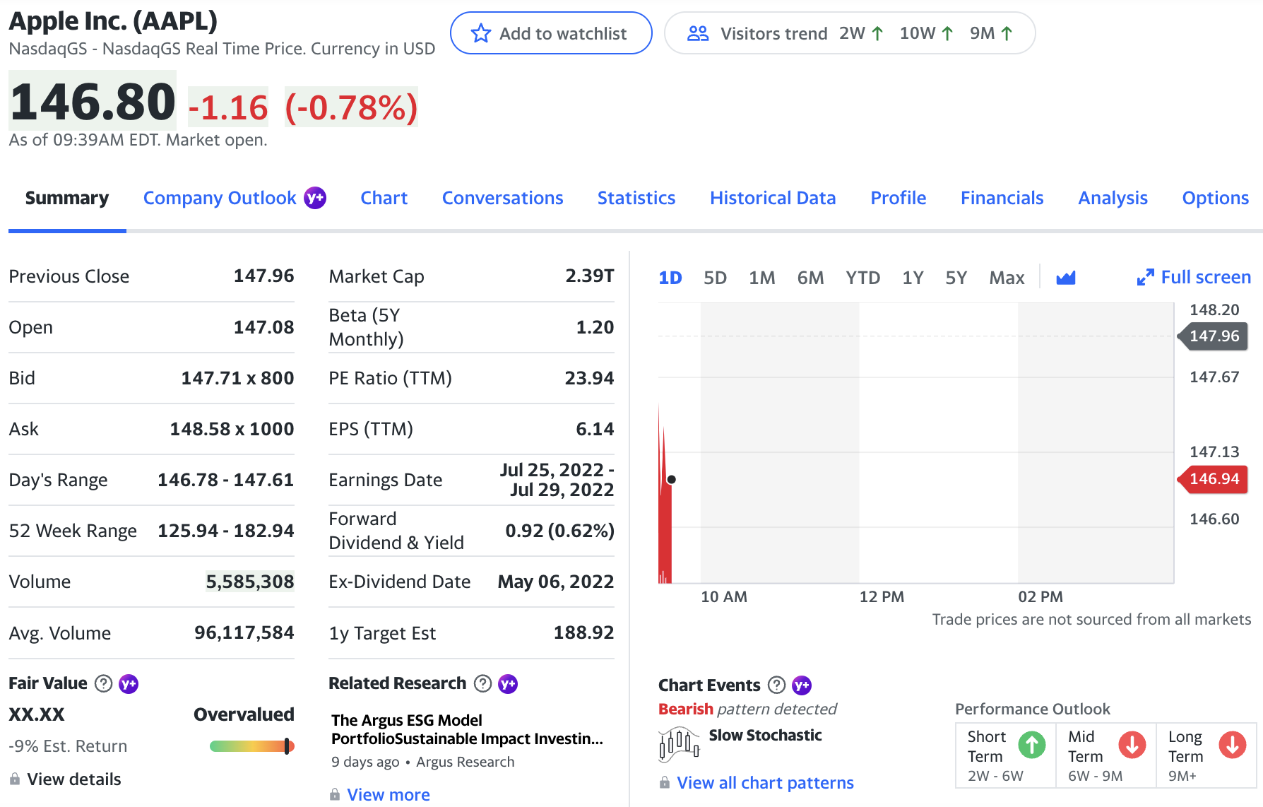
Next, click the ‘Full screen’ link in the top right corner of the chart to expand it.
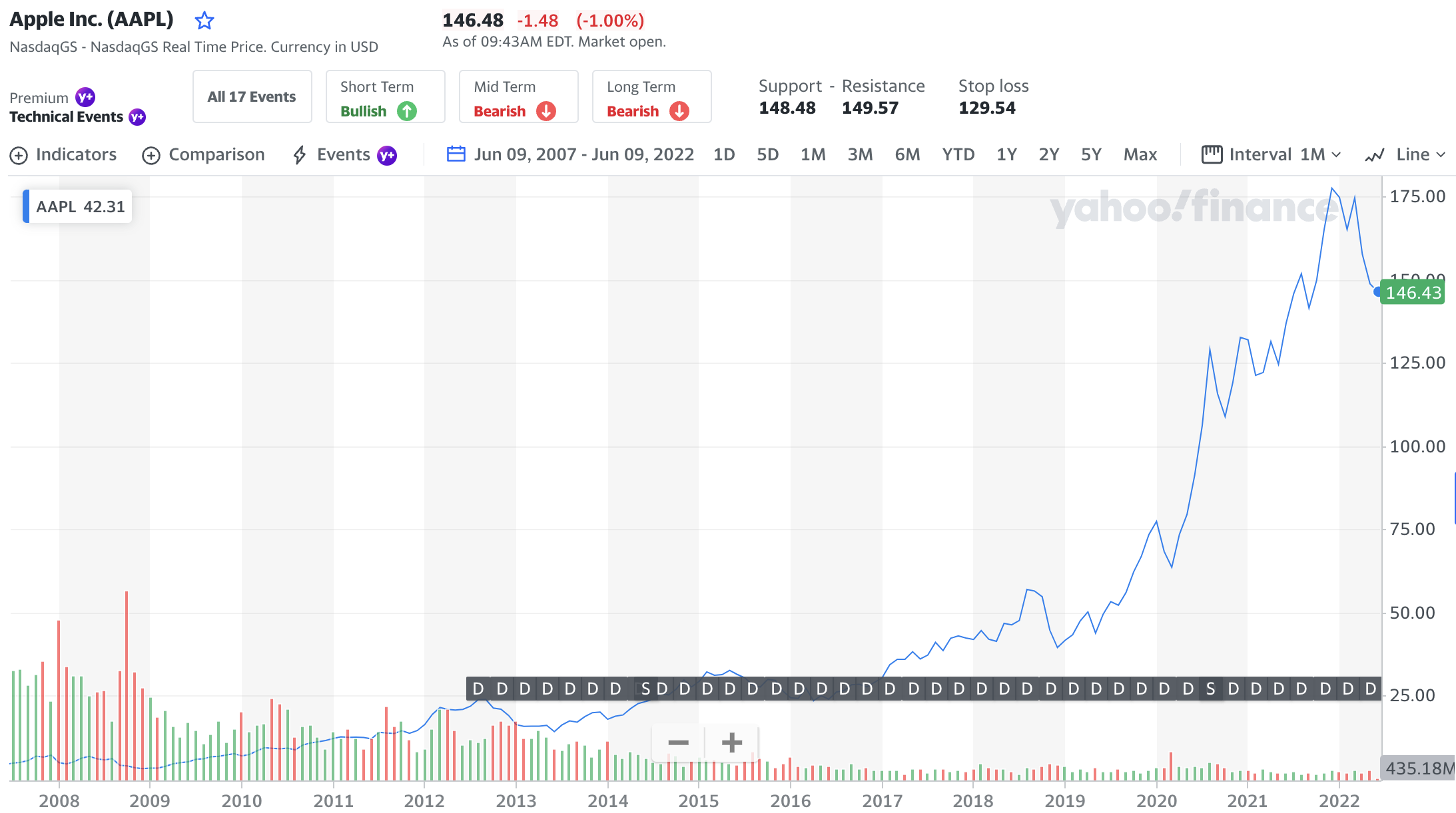
I’ve also taken the liberty of filtering to the last 15 years, which you can easily do by changing the date range near the top of the expanded chart.
So here we’re looking at the last 15 years of Apple’s stock. I bet you wish you would have invested in Apple in late 2008/early 2009!
Now let’s dive into the different pieces and parts of the stock chart so you can begin to read one like a pro.
Key concepts when learning how to read a stock chart
A stock chart becomes particularly useful when you know how to read its information and decipher what it’s showing so you can make more accurate predictions about how the stock will perform in the future.
Here are the four key data points you need to understand in order to fully leverage the power of a stock chart.
1. Identify the trendline
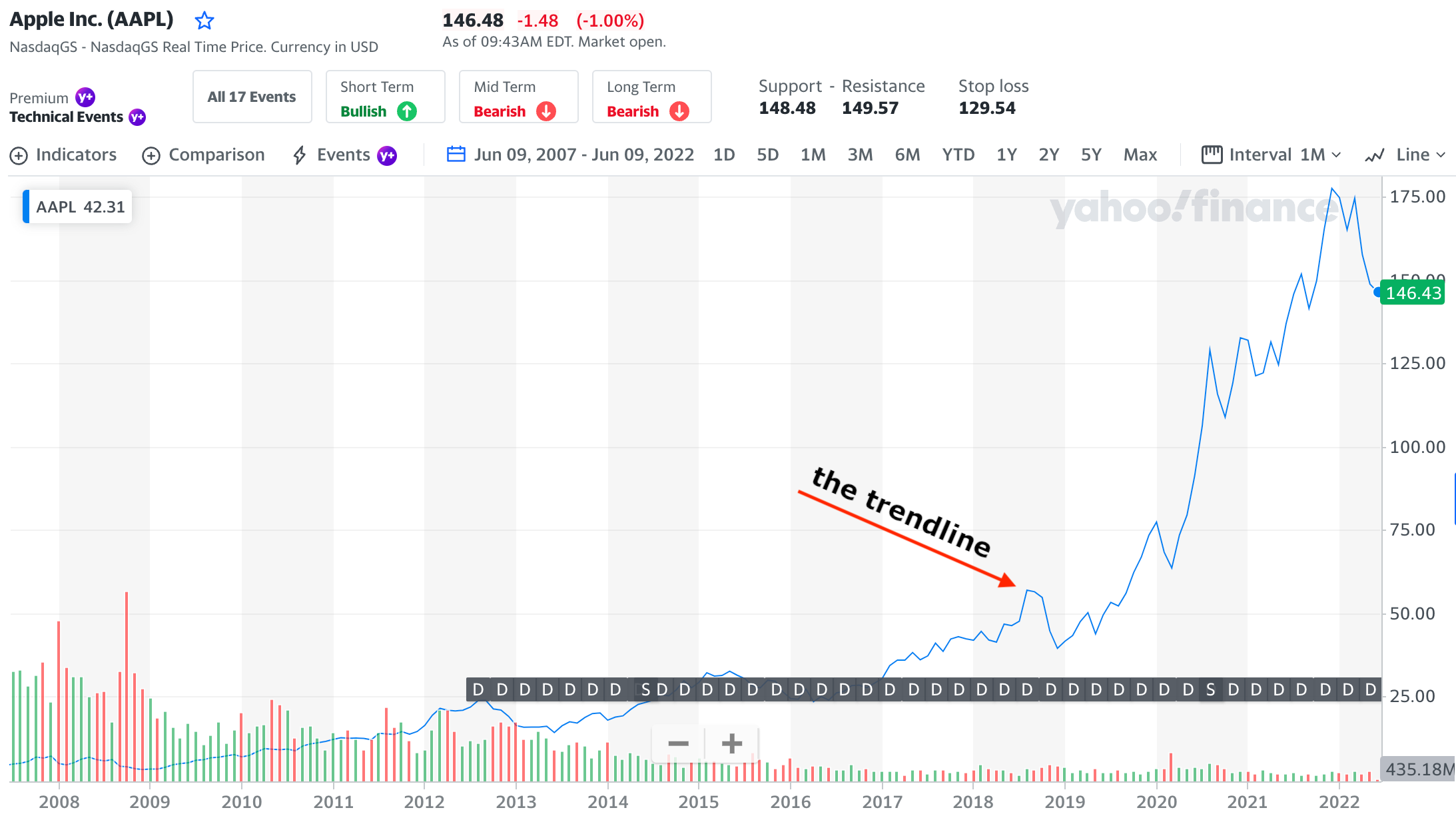
This is that blue line you see every time you hear about a stock — it’s either going up or down, right? While the trendline seems like common sense, there are a few things I want to call out so you can understand it in a little more detail.
First, know that stocks will take huge dives and also make huge climbs. Don’t react to large drops or huge gains in a positive or negative way. You should be using this piece of the stock chart merely to see what’s going on.
In fact, the trendline should lead you to dig further. For instance, Apple as a company really took off from 2009 to 2012.
But what happened from 2012 to 2013? The stock began to sink — at one point, shares were down more than 40%!
This is where your trendline comes in handy. News comes and goes, but when news coincides with a dramatic shift in the trendline, it’s something to pay attention to.
If you saw something like this happen, I’d urge you to find out what’s going on with the company. Most strong companies can rebound from hits like this, but not all can.
For those who don’t know, right around this time Apple experienced a few major shifts:
First, its longtime CEO, Steve Jobs, resigned in 2011. Then around 2012, Apple noted that its profit margins were significantly decreasing, despite a growing smartphone market. Finally, they were trying to expand the smartphone into developing countries, where they were just too expensive to compete.
These factors, combined with plenty of other variables, contributed to the stock price falling.
But new CEO Tim Cook made some strategic moves with the company to turn it around, and the rest of the trendline shows that.
The lesson here is to use your trendline as a first-glance, high-level indicator of something to look into.
2. Look for lines of support and resistance
Next, you’ll want to identify lines of support and resistance. A line of support is a price that a stock is unlikely to drop below, while a line of resistance is one that it’s unlikely to go above. That is, until some major change occurs, such as a reduced profit margin.
Think of these lines as bumpers at a bowling alley. When you’re bowling, the ball bounces back and forth between these inflated barriers.
A stock’s price does the same thing within these lines of support and resistance.
The goal here is to know when to buy and when to sell. Let’s take a look at Apple’s stock chart again to see an example:
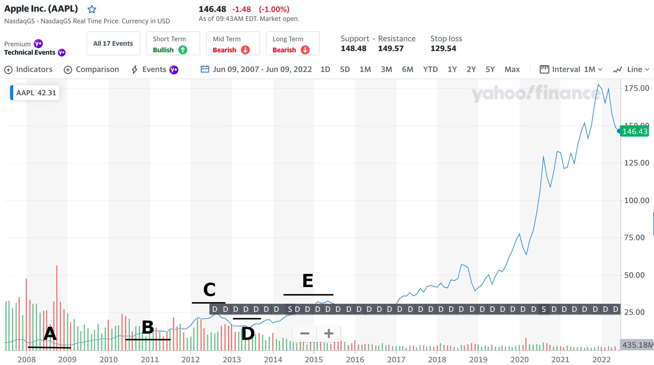
These are subjective and interpreted differently by everyone, but the process is important. Note that everyone will draw lines of resistance and support differently, depending on their investment horizon (how long they plan to hold the stock).
So, if you plan on holding it for a long time, you may not draw as many lines of support and resistance, because you don’t care as much about the ups and downs. But if you’re a short-term investor, you may draw more to analyze trends during a shorter period.
Let me break down the image above with each of the trendlines:
- Line A is the very first line of support shown. Based on trends prior to this, you can feel comfortable that the stock price won’t go below this point.
- Line B is my first line of resistance. You can see that the stock has peaked at that point for now and you shouldn’t expect it to go higher.
- As you can see with Line C, the stock has peaked again, thus creating another line of resistance.
- Line D shows the stock price has bottomed out again, creating a line of support.
- The price peaks again with Line E, and the trend continues as time goes on.
If it seems complex, don’t fret. It is. And a lot of it is guesswork.
Knowing the lines of resistance can help you decide when to buy or sell a stock. Remember, though, that it’s subjective and it won’t give you a clear-cut road map on exactly what to do. You’ll have to use some of your own analysis and judgment.
3. Know when dividends and stock splits occur
At the bottom of the chart, you’ll see if and when the company issued a dividend, as well as if there was ever a stock split:
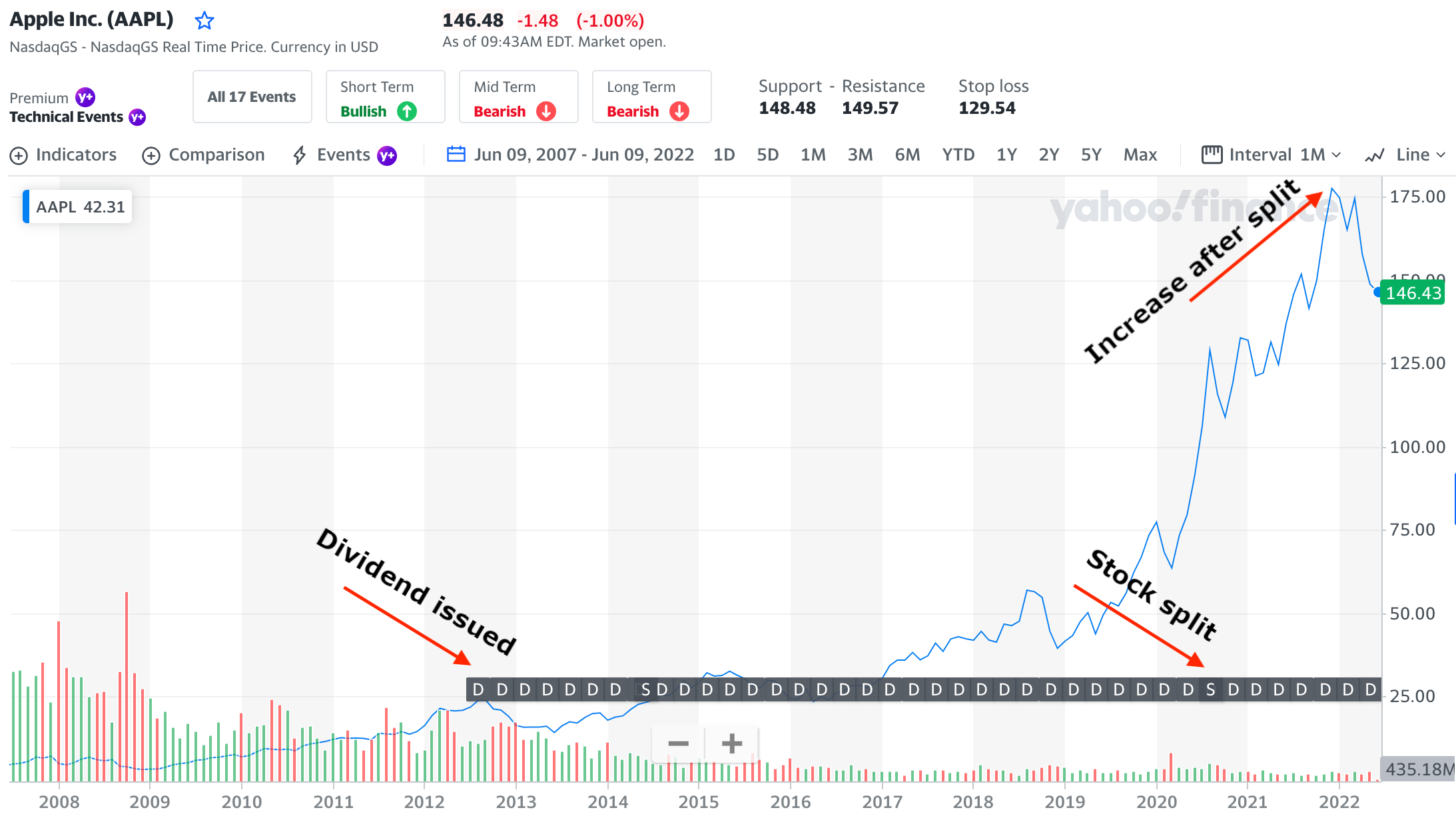
A dividend is when the company (the board of directors) decides to give a portion of its earnings back to its shareholders. If you own the stock, you get a small chunk of the profit.
Some companies issue dividends, some don’t. Just because a company does or doesn’t issue a dividend doesn’t mean it’s not worth investing in. There are plenty of other factors to consider.
Some companies just prefer to focus on growth, so they’ll reinvest their earnings as opposed to giving them back to the shareholders. Other companies (like Apple) can pay dividends without sacrificing growth.
As you can see by the image, Apple started issuing quarterly dividends to its shareholders midway through 2012.
You can also see that there were stock splits in 2014 and 2020. A stock split is a strategic move done by the company’s board of directors to issue more shares of stock to the public.
In 2014, Apple did a seven to one stock split (noted as 7:1), which means that for every share of AAPL you owned prior to the split, you’d now have seven. So if you owned 100 shares of APPL prior to the split, you’d now have 700.
The value of the company doesn’t change, but the share price might. Companies will often do this if the price isn’t in line with competitors or to attract smaller investors (if the share price decreases).
You can see the uptick in the trendline after the split occurred, too. Many times when a stock split happens, more people invest (since the share price is often lower) which increases demand and, in many cases, the overall share price.
4. Understand historic trading volumes
At the very bottom of the chart, you can see many small, vertical lines. This is a trend of the volumes at which the stock is traded.
Volumes are good to know, but shouldn’t be your only determining factor when buying a stock. Usually, trading volumes increase when there is major news (good or bad) about the company.
When volumes are increasing, it can also shift the price of the stock quickly. Let’s look at an example:

In Line A, you can see there was a high volume of trading activity that corresponded with a drop in the stock price. There may have been news that day that caused people to panic (aside from the entire economy crashing that year).
In Line B, you can see a slight uptick in trading volume that corresponds with an upward trend in the stock price.
Don’t always assume there will be a correlation between stock price and trading volume, but it’s good to know what the volumes have been in the past and what they are currently before making a decision.
With high volumes comes greater ease when buying or selling. If a lot of people are trading the stock that day, you should be able to buy or sell it quickly.
Where can you find some of the best stock trading tools?
Once you’re comfortable reading a stock chart and you feel like you have the basics down, you might be looking for a more powerful investment tool. Here are some great options we recommend.
Robinhood
Where alternatives like E*TRADE gives you all the bells and whistles, some people may not need all of that. Robinhood’s app does an excellent job of giving you just enough information to start to make more informed decisions.

Robinhood is a popular stock trading and investing app that offers zero-commission trades on thousands of investments, including stocks, starting with as little as $1.
With beginner-friendly features and easy-to-read charts, Robinhood is great for new investors and there's advanced features even more seasoned investors can appreciate.
- Commission-free trading
- Easy to use, well-displayed dashboard
- No obligation or minimum account balance
- No bonds or mutual funds
- Crypto fees can be more transparent
No, you can’t get as granular as I did above using the app, but you may not need to. Or, maybe you’ve already done your research on a Google Finance stock chart and just want to check in on how the stock is performing. Either way, Robinhood is an excellent platform with great trading tools.
» MORE: Read our full Robinhood review
Public
Public makes stock trading a social event — literally. When you use Public, you’ll have access to a community of investors — both long-time, experienced investors and beginner investors. This allows you to chat with others and get a sense of which investing strategy may work best for you.

Public is a investing platform with mobile app that has a wide range of offerings and features beginners will appreciate.
With Public, you can invest in stocks, bonds, Treasuries, crypto, ETFs, music royalties and alternative assets—with access to a social feed—all in one place.
- Commission-free trading on stocks and funds
- Fractional shares with low minimums
- High-Yield Cash Account that earns 5.1% APY
- Resources for beginners and community
- Does not support all account types
- No mutual funds
Besides this feature, Public also gives you access to stocks for as little as $5. They offer fractional shares, so even if you want to invest in a high-end company, you don’t have to spend thousands.
» MORE: Check out our full Public app review
Summary
Those are the basics of how to read a stock chart. Once you’ve mastered these concepts, you should be able to analyze a stock’s historic activity at a high level.
Remember that past performance doesn’t correlate to future indications on price. Meaning that just because Apple hit $180 per share recently doesn’t mean it will again. There’s also nothing to say it won’t double in price. You just can’t know.